Falling for Color: 9 Ways With Pumpkin Orange
By Jennifer Ott
With Halloween right around the corner I just had to grab the opportunity to give some love to one of my favorite hues: pumpkin orange. The key to working with this intense color is to use it for those items or areas in your home that you wish to call attention to. Then be sure to select coordinating colors wisely.
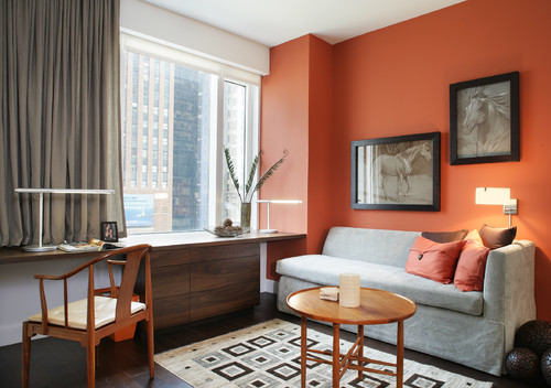
Coordinating colors similar to orange — shades of brown, red or yellow — will make your palette colorful yet harmonious. Shades of blue (the complement, opposite of orange on the color wheel) will create a dynamic, high-energy vibe. The more color shy among you might want to pair this intense orange solely with neutrals.
You can use it to warm up a predominantly white or gray modern interior, to keep the space from feeling too stark. Or you can use it to add some vibrancy to a traditional space that’s perhaps heavy on dark neutrals or deep wood tones. I’ve gathered nine examples that illustrate just how gorgeous and versatile this hue can be in a home, along with six of my favorite pumpkin-inspired paint colors.


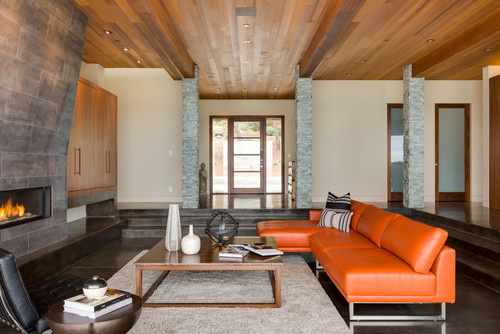
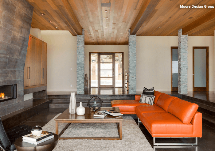
If you favor walls, ceilings and floors in neutral hues, think about adding a fun orange color in your furnishings. Furniture can get expensive, so you should make sure you love this color and want to keep it around for a while, but the nice thing about using furniture or decorative accessories for a jolt of color in a room is that they are fairly easy to update.

One of my favorite, and more unexpected, ways to bring bold color into a room is through light fixtures. Lighting now comes in all sizes, shapes and colors, and I love making a bold-hued ceiling fixture the centerpiece of a room. It draws the eye upward and can make the space appear larger.
Give your prized possessions the attention they deserve by painting the back or interior of your shelving or display cabinet a feisty shade of orange. You can also add a splash of color to the inside of a built-in niche. Pick up the color in small bits throughout the room to help move the eye around the space.

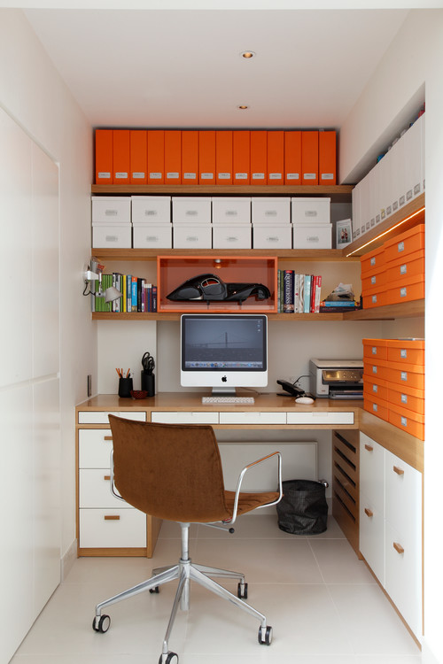
Consider a fun color for even the most utilitarian items in a room. I love the choice of orange for the storage boxes and binders here. It gives the office a happy, fun vibe.

Take bold orange outside with an exterior accent wall. This is a terrific color for outdoor spaces in a cold or rainy climate, because it can provide a warm glow during the chilly fall evenings.


No matter the style of your home, you can’t go wrong with a pumpkin-orange front door. But if you opt for this hue for the door, I recommend sticking with more neutral colors for the siding and trim, unless your home is minimalist and contemporary in style. This is because the more clean and simple the lines of the home, the easier it is to pull off a bold color palette without the whole thing’s appearing too busy.

Original Source: Houzz
Read the original article here
Original article: The Province
Read original aricle here.